A new website for a new era
Websites are more than shop windows. They are not simple content repositories; they are the embodiment of the soul of a business. Like scruffy shoes or unkempt hair, these first impressions are vital. That’s why we took a long, hard look at ourselves and decided that it was time for a makeover.
The world we live in is not the same as it was – even as recently as 2012. While content is still king, its domain has spread, with more communications channels than ever before, the majority of them digital. We needed our website to reflect the modern, smart and connected services that we deliver daily for our clients.
Paragon is nearly four years old. We’re just as enthusiastic as when we started, but we like to think a little wiser. Some of that is because we have a larger, more diverse team, but it’s also because of the learned knowledge that we have acquired through working with some great clients. We wanted our site to reflect these talents and experiences.
We also wanted to invest in a new site that will grow with the business. Thanks to our clients, the Paragon business is now more than twice the size it was just two years ago, and it is even more important that our brand reflects the maturing nature of our business.
For this reason, when we redesigned our website, we wanted it to be more sophisticated but more importantly, we needed it to clearly articulate what we do for our clients. In this regard, we are not unique. All websites should do this – spell out precisely what the business stands for on the home page, and provide clear navigation to sections that provide the underlying background or detail behind this top-level narrative.
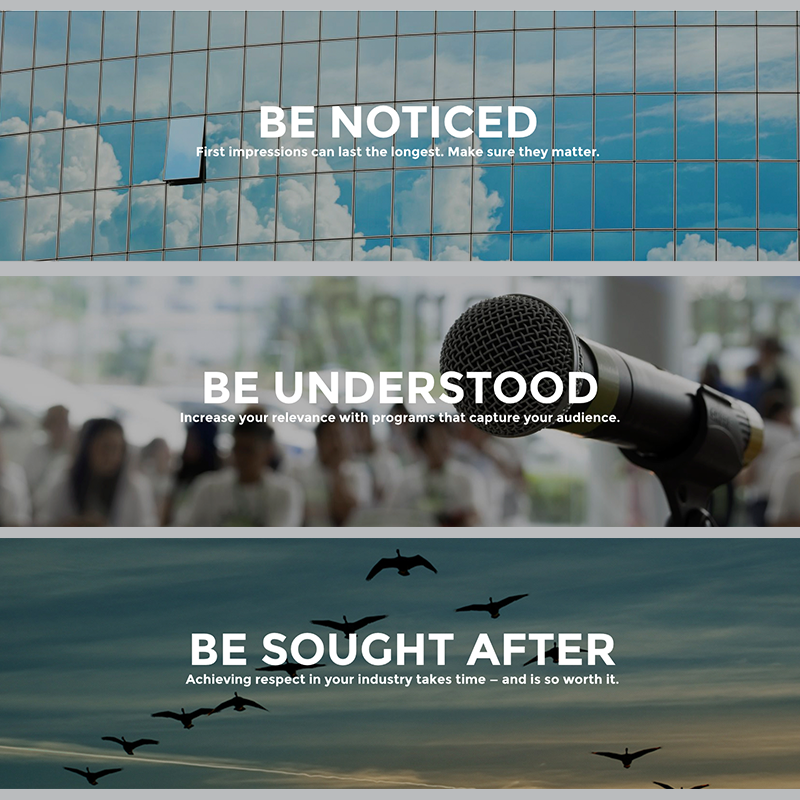
In our case, we wanted to make sure it was clear that we deliver strategies and advice that help our clients get noticed and understood by the audiences that they care about.
We’ve highlighted the Paragon360™ approach, which is a philosophy of understanding and articulating client challenges and opportunities, before executing campaigns and projects, and then measuring results and recalibrating accordingly. We’ve also listed many of our current client logos, as there is no better sign of success than the company you keep.
There are many other details that you will easily discover as you look through the new design. It’s not an intricate site; it’s designed to be easily navigated and understood. That’s because we believe that messages should be clear, succinct and impactful.
Thank you to all the Paragon clients that have allowed us to grow into the agency we have become. Without you, Paragon was just a vision.


Leave a comment:
You must be logged in to post a comment.