Going loco with your logo
Your logo needs to be perfect – a distinctive combination of colours and shapes and ideally a magical X-factor that sums up your story. It should be, too, after all those meetings, the in-depth research, the refinements, the soul-searching and the final tantalising decision. So why change it – even temporarily – on a whim?
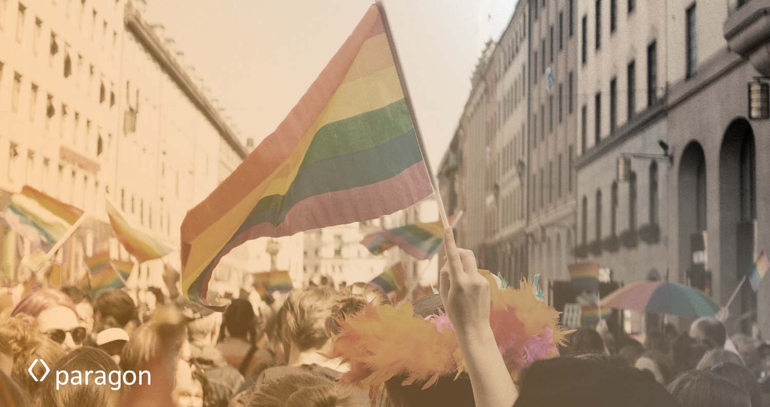
It is a question the team at British retailer Marks & Spencer (M&S) must have asked this month following the critical social media response to the special logo it produced to coincide with Pride. The very bright and breezy new logo is a sharp contrast to its very understated and traditional dark green.
No doubt the retailer, which sells food and clothes, was trying to attract a younger and more diverse audience to add to its long-standing and traditional customers who had, it seems, another celebration in mind… the Queen’s Platinum Jubilee. Cue a social media spat between the two. And a defensive M&S response:
“M&S is a proud sponsor of the Queen’s Platinum Jubilee pageant to celebrate Her Majesty’s 70-year reign and is celebrating the momentous occasion across all stores and channels,” explained the spokesperson, revealing a tactical bothism. “Like many other retailers, we have updated our social media logos to mark the start of Pride month.”
The logo, that vital and ideally subliminal mark of the brand, had become the story. Not good. That’s not its job. But tweaking a brand’s logo is clearly a real opportunity. One research report reveals that temporary logo change campaigns do two main things – boost brand image expansion and brand image focus.
The report concludes that the first option can create “new associations or strengthen current weak ones the public is not aware of.” That was no doubt the thinking behind the M&S campaign. The second can “highlight associations the public is already aware of” and convey “a message that further builds the relationship with those customers.”
Brand values vs. brand activism
To achieve these goals, brands often use one of two strategies. One is to exploit the brand itself and the second is to align the brand to a relevant cause. Google, which has made logo variation an intrinsic part of the brand, has cracked the former. The move started almost by accident back in 1998 when co-founders Larry Page and Sergey Brin headed to the Burning Man festival for a well-earned break and decided to celebrate by making a change to the logo. And they have never stopped… change is expected, perfectly symbolising a brand that is forever changing and pushing new digital frontiers.
It’s not a new strategy. Back in 2003 Louis Vuitton – the gold and brown bag brand that epitomises luxurious tradition – suddenly exploded into kaleidoscopic Takashi-Murakami designed life, including a new monogram. The message was clear: we know everything about design, from the exclusive and old-school to the funky and new.
An original sense of humour helps, especially if it leverages something unique about the brand and its logo. The McDonald’s celebration of International Women’s Day, which involved turning its famed golden arches upside down to create a “W”, is a good example. It appeared at 100 restaurants as well as on the uniforms and packaging. There were headlines galore. Was it a practical joke? Had Wendy’s gone wonky? What a success!
But then the sniping began. “Hey @McDonalds, maybe instead of a cheap PR stunt where you make the M a W to ‘support’ women, you do something real — like paying your workers a living wage,” tweeted one unhappy critic. More joined in.
When KFC revealed a similar stunt by making the colonel a female, it was too much for some. “Though they were nice gestures,” tweeted Nicholas Ferroni, “I can’t imagine I’ll be teaching about the Third Wave of Feminism was finally fulfilled when McDonald’s flipped its logo and KFC revealed a female Colonel.”
McDonald’s had made clever changes to its logo but in doing so had also stepped into the perilous arena of brand activism, where authenticity is critical. Where the lens of the microscope is focused on everything, your operation does, from the end of the supply chain to workers’ pay rates.
Back to M&S and its colourful logo in support of LGBTQ+. Yes, of course, the brand runs the risk of being scrutinised and criticised for not having the most enlightened policies in the world. But there is another question the marketing team needs to ask themselves: Now that brands galore are riding the rainbow bandwagon, is the campaign the opposite of distinctive and a turn-off?
Are you looking for ways to reinvigorate your logo? We can help with that – just reach out!


